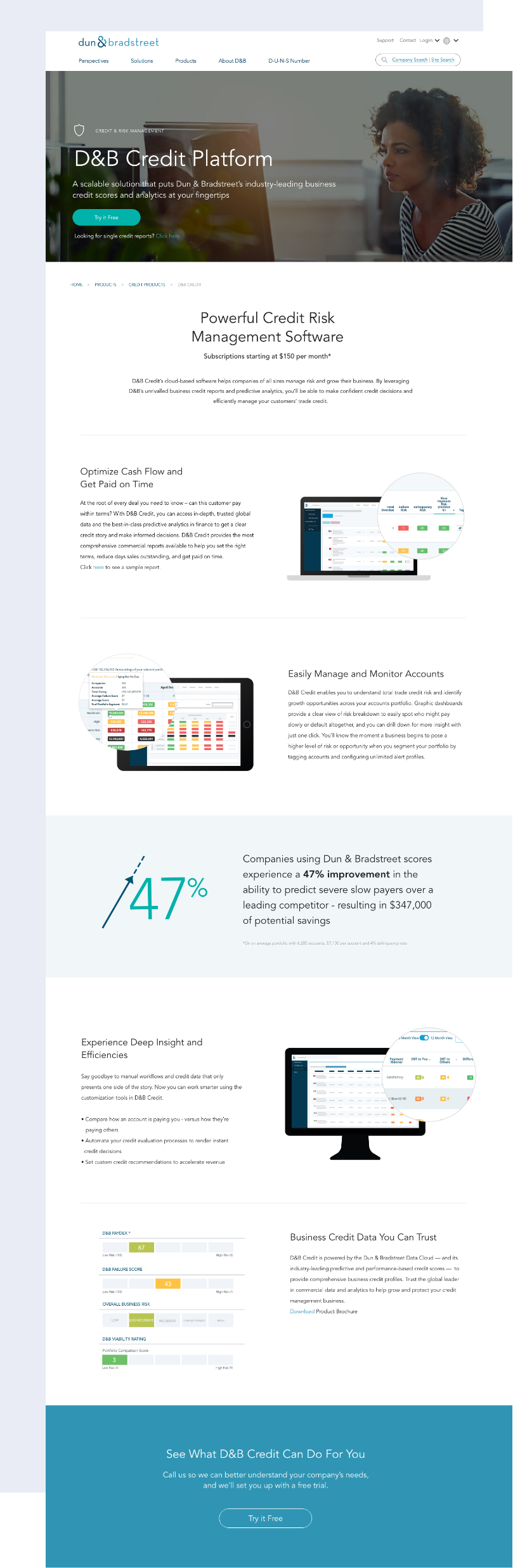
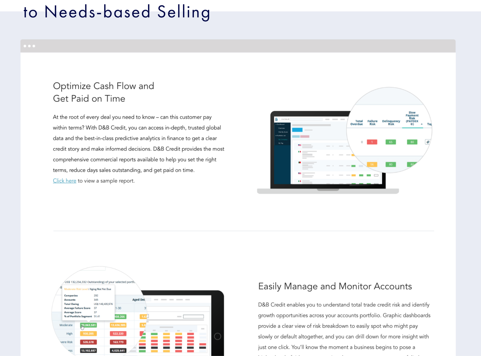
D&B Credit is a family of products that is scalable, flexible and customizable. It is one of Dun & Bradstreet’s most popular and well known products. I worked with the testing and optimization team to test a new approach to talking about the products.
ROLE —- UX + UI
TOOLS —- Adobe XD + Adobe Illustrator
DURATION —- July 2018
CREDIT —- Tara Yukawa - production / Tracy Panek - copy / Tony Baby - Testing
TOOLS —- Adobe XD + Adobe Illustrator
DURATION —- July 2018
CREDIT —- Tara Yukawa - production / Tracy Panek - copy / Tony Baby - Testing
WHY?
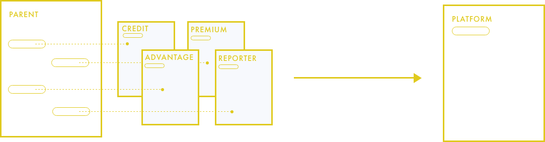
The original D&B Credit family page introduced the 4 product editions, but pushed the user to decide which product is right for them. It was hard to decipher the differences and users were left to figure out which product was best for them. This experience was overwhelming and more of a consideration/decision phase construct, rather than an awareness phase or first-touch web experience.
SOLUTIONS
We wanted to try a page that introduces the platform and all the feature options from the different product levels, but not pushing them down the route of one product vs another. Rather we want to set the user up to have a business needs conversation with sales reps.
APPROACH
We developed a new page design and messaging that positioned D&B Credit as a product suite that is scalable, flexible, and customizable. We removed mention of the different product versions, and focused on customer pain points and how D&B Credit can solve those. This approach also better positions Sales to do needs-based selling.
Simplified page for better user experience
• 9 CTAs vs 1
• 10 components vs 8
• added customer quote and proof point
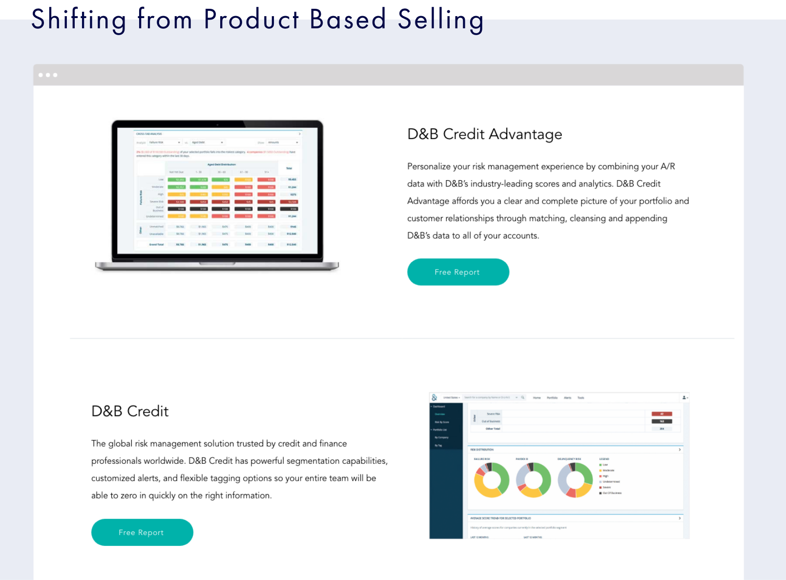
• removed product comparison chart
• 10 components vs 8
• added customer quote and proof point
• removed product comparison chart
TESTING
The new design went through 2 rounds of UserTesting (9 users per group). These were unmoderated and conducted on a InVision prototype. I really enjoyed working with the testing team on developing the script and watching the users interact with the design!
RESULTS
Conversion rate increase 75%!
LEARNINGS
This page had been re-written just a few months prior, adding the “Family” page and a product comparison chart that only confused the user and created a lot of work for our teams. Uncountable design, writing, and production hours had been spent creating a solution to a problem that nobody was having. It doesn’t matter how elegant, clever, or pixel-perfect a solution is if it answers the wrong question.